Monday 24 March 2014

Introduction to Claudia and Quentin!

Breakdown of Claudia and Quentin:
Claudia and Quentin are two fictional characters. Claudia is a woman in her 20's who has had no parental guidance and is very misunderstood. She is an agrophobic and is kept in touch with the outside world by her neighbours, who bring her food and everything she needs. She has an extremely unhealthy relationship with horror movies. That is how she believes life really is, everything is based on horror. She's very psychotic and models herself on the people she sees in the horror films. So her appearance changes depending on what movie she is watching. This gothic horror lifestyle is normal to her. She has an imaginary boyfriend, Quentin. They don't have a very relationship, he is a constant disappointment. They don't live together, though he comes round and calls her a lot as she sometimes shuts him out. His appearance changes to suit her mood, so sometimes he could be David Beckham, and other times Prince William. If she's at a particular low, he could even morph into e.g a chav, so he isn't always handsome. Quentin is also into horror films and role play to fit Claudia's mood. Claudia is paranoid and suspicious that he is having an affair and keeps him under the thumb. Literally she would tie him up, lock him in and punishes him.
The aim is to create Claudia and Quentin for a music video which takes place in her apartment.
After receiving this brief i was excited to start researching. I found Claudia particularly intriguing and was looking forward to developing my character for her.My first initial thoughts on where to start would be looking at different mental illness's that Claudia is probably suffering from as this would effect her appearance along with the horror films. In the lesson where we received the brief for this project we were also shown various images and clips to inspire us to start our journey creating the characters.
We were shown Micheal Jackson's Thriller video. This was a huge step for music videos when it was released. Watching it you see that horror had moved on in this form. It's more stylish and everything is considered and symbolises something. Micheal's clothes colour are red for danger and she was in pink for innocence, with a contrasting blood red lip. It sets the scene from the very beginning, with the eerie noises. The famous dance routine is inspired by zombies and how awkward they would move. The same with Rihanna Disturbia. This is a lot more recent and the lyrics and song actually in keep with whats happening in the video along with her look and styling. The dancing in the video is also linked in with Micheal Jackson Thriller with quick jolting stiff movements. The part in the video when Rihanna is laying on a male mannequin immediately reminds me of Claudia with her imaginary boyfriend. Along with the fact the Rihanna is the central character and all close ups are on her. Which is what i would imagine Claudia and Quentins video to be like. She would be the central character and he would be in the back until Claudia summons of wants him. The main foucs would be Claudia.

We were also shown this image which i found inspiring. It is a painting by John Henley Fusely called The Nightmare. It's of a woman who is having a night terror. The scary gargoyle is to symbolise the feeling that you get when you have a night terror when you feel like you can't get up or move. This could relate to Claudia as she could feel trapped in her house, or head.
Dixon A. (2000). The Nightmare, by Henry Fuseli. Available: http://www.andrewgrahamdixon.com/archive/readArticle/48. Last accessed 24 march 2014.

I am looking forward to starting my research and developing my characters for this project. 

Sunday 23 March 2014

Estella Conclusion

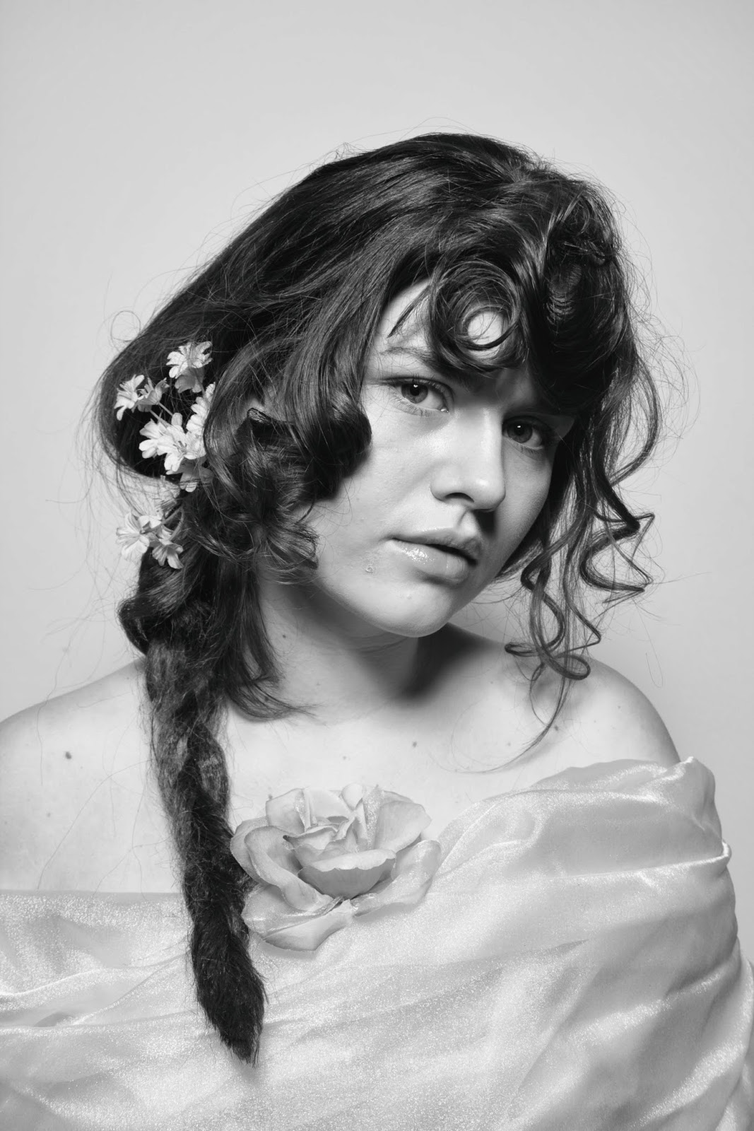
After completely my Estella look there were things i was happy with and things i wish i would have the chance to develop further. Overall i thought the look as a whole worked and worked well on my models face which i feel is a big aspect to a design working or not. I think the make up came out well, as i wanted something natural and youthful. I concentrated on getting the base applied really well as the photos were shot in black and white and this is an element that would show. I am glad i changed the fringe on my hair design to suit my Estella's age as i felt like even though i wanted a harsh fringe i don't think it would have been that harsh at that age. This would have been the starting to point to Estellas harsh blunt fringe. The only thing i was disappointed with was the structure at the back. I wanted a bigger, harsher and straighter shape and i don't feel i achieved this. The reason i believe i lost the geometric shape i was aiming towards was because i didn't put enough padding in and the right shaped padding. I should have made the padding exactly what shape i wanted the hair to be, but i made the padding to give it more volume and tried to create the shape with the hair myself when i could have just let the padding do the work for me and place the hair over the top. Overall though i was happy with the outcome and know exactly where i went wrong and where i would go if i was to develop it again.

Conclusion to Miss Havsiham Continuity

Overall i feel like my final outcome of my design for continuity came out well. There were a few minor things looking back at the photos which i feel i could have improved. For example, there was slightly more height in the back of the hair on the first one. And the eczema cut on the face was more red in the second too, although this could be lighting. However i feel i did well and i tried hard to pay attention to every detail of my first look whilst creating my second and kept referring back to photos as i worked. I feel like i have interrupted the brief well, and have known when my ideas were becoming to avant-garde and over the top and was able to step back and keep it Victorian and stick to the brief i was given. I researched a lot about the Victorian Era so i knew what was going on in terms of make up, hair, hygiene, health, etc and i feel this reflected in my look. I was pleased with the Make up application on both shoots, however i would have liked it to be more blended in my first looking back now. I was happy with the red, patchy skin i created on the face and hands, and the dirtied effect i created on the hands and nails. The only thing i would take out of my design if i had to do it again, would be the cobwebs. The reason because, is that i had placed them exactly the same as i did on my first assessment on the second one, but the light made the show up differently, so i don't think these are good for continuity. Overall i was happy with my design as i feel i followed the brief well, and my continuity assessment as i think i re-created it well and my skills and confidence in this area have grown.


Miss Havisham Continuity #2

These are the images from my second assessment for Miss Havisham.


Overall i was really pleased with how the look came out. I tried to pay close attention to every detail of my first look referring back to the pictures as i went on. Down to how the eyebrows were postioned in the first shoot. I feel like my placement of the make up is the same, however the eczema patch is more red in this one. I feel the front of the hair was the same as the first. I made sure that all the little hairs that were out on the first images were the same in this. The only thing would be the back structure is slightly higher in the first then it is here. Another thing i would do differently if i was doing this project again is not to used the cobwebs, or come up with a better material to use that would work better for continuity. Because although i placed them in the same place and used the same cobwebs they came up clearer in the second due to the lighting.

Miss Havisham number 1.
Miss Havisham number 2.


Wednesday 12 March 2014

Estella Face charts


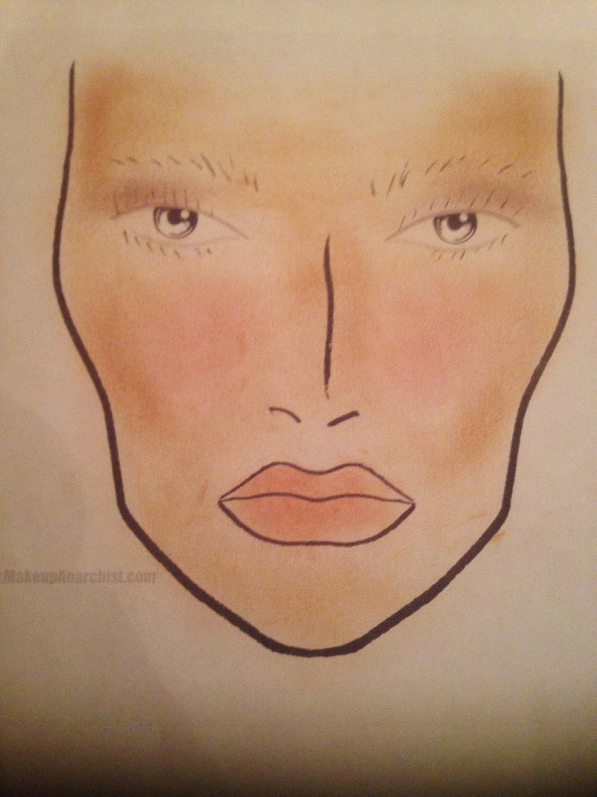
After thinking and researching ideas for Estella, i have chosen to do a young Estella. Her make up because of the period it is in and her age for these reasons would be very minimalistic. Also where to images are being shot in black and white i think its best to concentrate on getting a good base. 


This is my first face chart. Its very simple, just with a base, bronzer and highlighter. A slight rosey cheek and a nude lip. 

Experimentation: 

After experimenting with this look i new this was the overall look i wanted. So i decided to experiment with different shades and gradients.

This is my second face chart. I have gone for the same as above, but with everything slighty heavier so it will show up better in black and white. And i have added some mascara to the eye just so they pop a little bit more.

Experimentation: 


This is my final design for Estella and this is the look i am going to use for my final assesment.
I have again made everything slightly heavier so it will photograph better and i have also added some brown shading on the eyes, to bring them out more in the photograph more, but not making it look like eye shadow and that she has make up on.


Tuesday 11 March 2014

Estella.


My initial thoughts on Estella was that she was very well done, tidy and clean. Unlike Miss Havsiham, who would be more the kind of Victorian women who would change her clothes 4-5 times a day, look very conservative, wear big fancy dresses and tight corsets. I feel she would keep herself very up together all the time and look flawless, to attract the attention of men to then break their hearts. Maybe this is another reason Miss Havisham has let herself go as she if focusing all her attention on Estellas appearance?
My first initial thoughts on Estellas make up is that she would have very little if any at all. A rosy cheek and perfect skin. However as time goes on and Estella grows up although make up wasn't used often in the Victorian Era i feel Estella might start using it when she moves to London.
My first thoughts on Estella hair would also vary as to what time it is in her life. When she's young i think there would be elements of her cruel side coming off in her hair but also a lot more curls and waves going through it. However as she grows older i think it would get neater, tighter, slicker and blunter.
 Some images from Pinterest:


http://www.pinterest.com/lailahamidi/estella/


My Estella!

Estella Hair: 
 I think Estella has a very cruel side but there are aspects of her personality which show a warmer side to her. I wanted to try and incorporate both of these in my hair look. I think to be able to do this i would need to do a younger Estella, as when she gets older i feel like her hair would be more cruel looking rather than having aspects of both. As when she is younger she still has that bit of innocence in her which would come across in her hair. To create the more cruel side i went back to my 'cruel' pinterest bored where i had images that i thought the hair represented the word 'cruel.' These images were mainly of fringes covering the face, and had very sharp, harsh and blunt edges of the hair.

After researching for a victorian hairstyles on pinterest which i felt like reflected Estellas character i came up with an idea for the hair. I decided to go for a half up half down style.
 With the hair that is down i wanted to plait it, but make it look quite straight and blunt, (not like your normal plait which is more loose and flowy.) I would achieve this by hair spraying the plait front and black and then go over it with straighteners which would give this effect. The plait would also be made out of extensions. The section that i would be putting up I would create a large structure using padding which had defined edges. I also want to use a clip on fringe as my model does not have one.
I also wanted to incorporate Estellas more warm and loving side. For this i wanted to curl the front section and leave it loose and flowing and add flowers to the hair. Although the images have to be in black and white, if they didnt i would add different colours, like reds and oranges to show her warm side too as i feel these are warm colours.

First experimentation: 


I sprayed the outside with dry shampoo to see what it would photograph like it black and white.
Experimentation on my partner Millie: 


After experimenting on Millie i wasn't too sure i wanted the fringe to be so harsh, as although it is part of what i wanted for my look and my interpretation on Estella. I also need to remember that my Estella is in her teens and don't think it would have started off so harsh, but it would develop as she got older. So for the final look of Estella i would make a fringe out of the curled hair so it still covers the forehead but in keeps with the age of my Estella.

Estella Make up: 
As i decided to create an Estella who was in her teens i think she would be very natural looking. Also through research for Miss Havisham, make up wasn't worn by the everyday woman in the Victorian era (mainly prostitutes) so i don't think Estella would be wearing it for two reasons. One because of her age and two because of the period it is based in.
http://www.pinterest.com/pin/481322278897608468/

I want to keep in very natural and have a good base, some highlighting and shading, a small amount of blush, and a very natural glossy lip. Also where the photos are being taken in black and white these are the areas that need to focused on the most.

Face chart 1: 


I think as Estella gets older and moves to London she would start wearing more make up maybe to catch the attention of men. So the same as the hair, as she ages and progresses, so does her look.

Experimentation of design: 


Final shoot:


Make up products and step by steps:
  • Mac foundation.
  • Derma colour.
  • Mac bronzer.
  • Lip rouge mini pallete.
  • Screenface eyeshadow pallete
  • Mac lipgloss.
  • Illamasqua satin primer.
  • Bobbie brown blusher.
  • Illamasqua translucent powder.


Apply primer and foundation a blend well.  Powder.

Contour face and highlight. Highlight under eyebrows and eyes too.

Apply blush to cheeks subtly

Apply lip colour to lips and gloss.

Curl eyelashes.

Hair products and step by steps:
  • Brush
  • Section comb.
  • Grips
  • Hairspray.
  • Padding
  • Fringe
  • Extension.


Section hair creating four equal sections from top to back, add padding and wrap hair around. Do this with all sections.

Grip in extension at the bottom and cover parts that show.

Curl front section.

Clip in fringe.

Add flowers to the left side and grip in by plait.

Spray outside of structure with dry shampoo to give a lighter shade to show in black and white.


Monday 10 March 2014

Miss Havisham Continuity #1

This is the outcome for my first timed assessment for Miss Havisham. I was pleased with how it came out. I like how well the make up shows up, but doesn't look to over the top. Looking back now, i wish i had blended the lines slightly more, as i feel they are a little bit to harsh still. I felt like my time management throughout the assessment was good.


Hair Miss Havisham step by steps.    

Products.
  • ·      Crimpers.
  • ·      Brush
  • ·      Pin tail combs
  • ·      Grips and geishas.
  • ·      Padding
  • ·      Cobwebs
  • ·      Veil
  • ·      Hair spray
  • ·      Dry shampoo.
Step by steps.

  • ·      Section hair and crimp.
  • ·      Section hair from ear to ear and grip front section and leave.
  • ·      Back comb the hair at the back.  Leave section at the top of the hair.
  • ·      Start creating French pleat but brushing over the left side and cross gripping up the center.
  • ·      French pleat the hair but adding the padding provided at the top of the French pleat so some is still sticking out the top. Grip hair in place.
  • ·      Take the section you have left at the top of the hair and wrap around the padding starting with the left side first. Secure well.
  • ·      Take the section you left at the front and barrel it;. Make sure it all joins and reaches the French pleat so there is no gap in between.
  • ·      Secure the cobweb with grip underneath the fringe section and bring on to the French pleat.
  • ·      Secure the veil at the very bottem under the hair so the top is hidden. 

     Make up Miss Havisham step by steps.

    Products:
  • ·      Illamasqua white foundation.
  • ·      Kryolan alabaster.
  • ·      Dermacolour camfolage pallete d15, d16, d2 and d3.
  • ·      Kryolan supra colour browns and reds.
  • ·      Kroylan eyeshadow pallete browns and blues.
  • ·      Duo eyelash glue.
  • ·      Mac brown eyeliner.
  • ·      Glycerin.
  • ·      Illamasqua transluecent powder.
    Step by steps.
  • ·      Place duo on the face where shown on facer chart and wait to dry. Add a couple more layers. Pick off to make it look like dry skin.
  • ·      Mix foundations together, (shades above) and cover the face ears and neck. But not over where duo is.
  • ·      Using the brown shades from supra colour, derma colour and eyeshadow pallet apply under eyes and a bit above and on cheekbones.
  • ·      Add blue under the eyes too to make darker.
  • ·      Using a darker shade and wrinkles in natural lines around eyes and under eyes are on forehead and blend well!! Make sure it is blended well as it shouldn’t look theatrical.
  • ·      Apply a grey and browns over the lips.
  • ·      Using the red tones in supra colour and eye shadow pallete build up colour where the duo is applied to look sore eczema like and powder to make look even more dry.
  • ·      Using mascara wand or eyebrow brush make the eyebrows messy and add grey tones throughout with grey eyeshadow and dry shampoo.
  • ·      Add glycerin to forehead using pipette.
  •     Cover hand in the same colour foundation adding brown colour underneath nails and brown shading on hands.
h    If i could develop this look further, i would try to find a way to make her face look dirtier, as i felt like this was a aspect of my initial ideas and concept that i didn't achieve, as i didn't now how to achieve it. I would have liked to be able to have made her look as dirty as the pictures in my mood board.